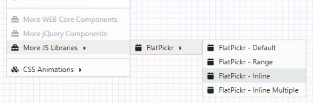
Extend TMS WEB Core with JS Libraries with Andrew: FlatPickr

Motivation
- Week Numbers. I work with many clients from the agriculture industry where week numbers are used all the time, probably more often than dates, in fact.
- Variations. Sometimes it makes sense to display a full month calendar on the page. Maybe even two months. Sometimes it is a drop-down. Sometimes there’s also a time. Sometimes there’s only a time. Being able to use the same control in different variations helps with providing a consistent user experience and results in fewer headaches as a developer.
- Restrictions. Having a start/end range for selectable dates is important, but it is often necessary to be able to provide a list of available dates to the component, and for the component to make it clear to the user which dates are available to be selected.
- Selections. The flexibility to be able to select an individual date, multiple dates, or a range is important, but making it simple is just as important.
- Themes. The component has to fit in visually with the rest of the project. My projects typically use CSS for theme work, so bonus points if it can be themed easily with CSS. But at the very list it should provide some options for the ubiquitous light and dark themes and should not stand out from the rest of the project.
Each of the included datetime picker components mentioned earlier came up short in some way or other. It is likely possible they could each be extended to add a missing feature or two. But none were close enough to make this an attractive option. A quick search for `datetimepicker` on GitHub brought me to FlatPickr, which provides all this functionality and more. But there are many datetime pickers out there. If FlatPickr or one of the included components doesn’t work for your situation, there’s likely another one out there that does.
No TDateTime to Waste
Getting started with FlatPickr follows the same steps as all the other JS libraries we’ve covered so far. Just add a link to your Project.html file directly or use the JavaScript Library Manager that can be found in the Delphi IDE. FlatPickr is pretty popular, so finding it at your favorite CDN likely won’t be a problem. Here’s what we’ll be using for this article and in the Sample Project.
As I’ve mentioned numerous times previously, the choice of using a CDN link versus a locally hosted copy of these files depends on many factors. In this instance, FlatPickr is widely used and under active development. A recent release broke a piece of functionality that, while not critical to its use, impacted more than a few of its users. But it was fixed within just a few hours. Whether that kind of scenario terrifies you or not will likely weigh heavily on whether or not to use a CDN.
Like many of the Control JS libraries we’ll be covering, FlatPickr does its thing by attaching itself to an element on the page. In this instance, it is convenient to just use a TWebEdit control. For this first step, I’ve dropped one on a form and then set its ElementID and Name properties to be DatePicker1, cleared out the value for Text, and set TextHint to “Select Date”. In order to connect this component to FlatPickr, I’ve added the following to the WebFormCreate procedure of the form.
  asm
    var flatpickr1 = flatpickr('#DatePicker1', {});
  end;
The #DatePicker1 is of course referring to the ElementID that was set for the TWebEdit component. Other selectors can also be used if you’re in a situation where the ElementID doesn’t work particularly well. We’ll also cover that flatpickr1 variable in a moment. But just to get us started, that’s all we need to get FlatPickr up and running with all of its defaults. The TWebEdit appears, and if you click on it, a calendar dropdown appears, and populates the TWebEdit with the date selected.
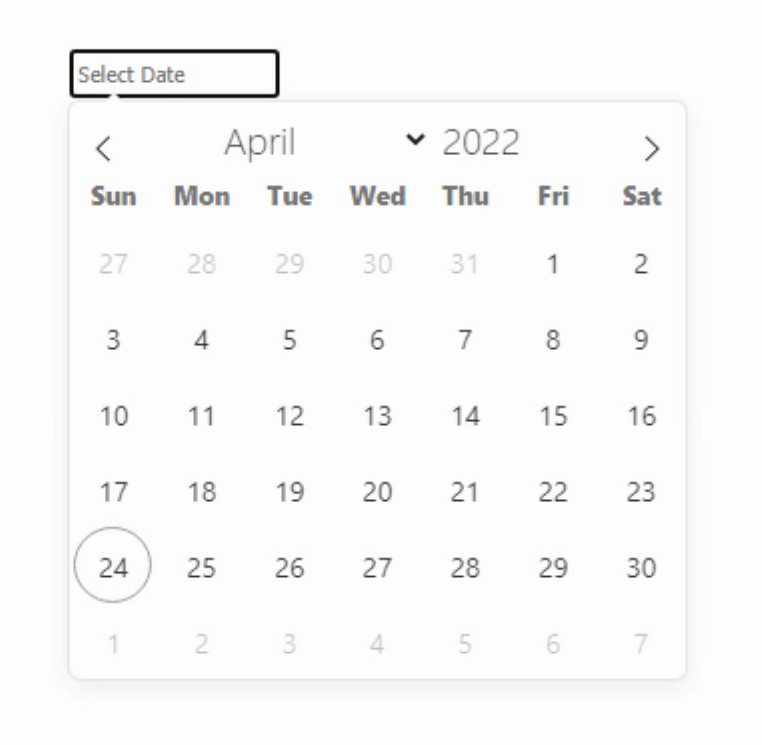
Default FlatPickr attached to a TWebEdit
In its default configuration, it is a date picker rather than a datetime picker. And the only way to select a date is from the dropdown, no text entry is permitted. But these are all things we can adjust.
We’ve Got Options
In the code above, FlatPickr was configured with no options, which is what the {} represents. There are of course many options and the FlatPickr site does a wonderful job of laying them out clearly with many examples. We’ll cover a handful here, but be sure to check out their website for all the details, particularly if you’re not totally committed to ISO8601 as far as date and time formats are concerned.
Options can be supplied either when a FlatPickr instance is first initialized or by calling the FlatPickr set() function later. We’ll have examples of both in due course, but the first option we’ll want to try out is the week number support. Just change the above code to look like this.
  asm
    var flatpickr1 = flatpickr('#DatePicker1', {weekNumbers: true});
  end;
And that’s it, week numbers are enabled. They’re not selectable and don’t do much other than sit there and look pretty, but that’s enough for now.
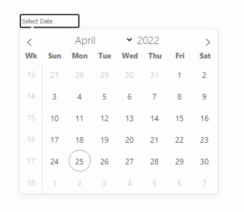
Week numbers enabled
Many other options can be specified in the same way, but before we get to those, just a few thoughts about these kinds of parameters and JS libraries in general. This is pretty common as far as passing things like setup options in JavaScript code. Once you start piling on numerous options, each with their own sub-options, it starts to look a bit like JSON. But it very specifically is not JSON. It is a JavasScript Object. What’s the difference? Doesn’t JSON stand for JavaScript Object Notation? Well, we’ll get into the specifics another time, but the main thing to know is that these kinds of options are typically key/value pairs and the key is specifically not surrounded with double-quotes. So it immediately isn’t JSON as a result, which requires double-quotes around its keys. This might seem like a nit-picky sort of thing, but something to keep in mind.
Like the rest of JavaScript, most things here are very much case-sensitive. So WeekNumber, weeknumber and Weeknumber won’t work, only weekNumber. And that’s also typically how these kinds of things are named. When there are multiple words, the first is not capitalized, but each subsequent word is. The value side of key/value pairs can be simple things like true or false or a number or a quoted string. But they can also be arrays or nested groups of values, as we’ll see when we get to specifying specific selectable dates for FlatPickr. And finally, these key/value pairs are typically comma-separated. Which isn’t particularly interesting, but good to know when the list of options grows to be so long that you have to scroll around to see where it starts. And the available options are, unsurprisingly, unique to each JavaScript library or project. Be sure that you’re looking at the version of the documentation that matches the version of the code that you’re using, as this is frequently where changes are made.
To replicate what most people might expect from a simple datetime picker, let’s turn on the ability to edit the date directly by typing into the TWebEdit field, and also turn on some of the time-related functions. We can set the default date/time to be the current date/time – normally the time defaults to noon. Things are already getting a little more complicated, but not crazy by any means.
  asm
    var date = new Date;
    var flatpickr1 = flatpickr('#DatePicker1', {
      allowInput: true,
      defaultDate: date,
      enableTime: true,
      enableSeconds: true,
      time_24hr: true,
      weekNumbers: true
    });
  end;
This gives us the following, where we can now type into the field if we want, and the time is editable both in the TWebEdit field and below the calendar. There are more options related to the time, such as hourIncrement and minuteIncrement which control the behavior of the up/down arrows that appear when the time is being edited.
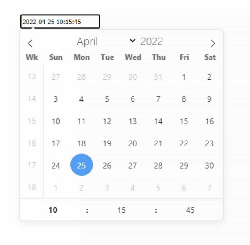
FlatPickr as a DateTime Picker
The selected datetime is stored in the text field of the TWebEdit, so in this case we can get it from Delphi just by using DatePicker1.Text. No trouble at all. But note carefully that this is a text field and not a TDateTime value. Also, we might want to know when that value has changed.
Parameter Functions
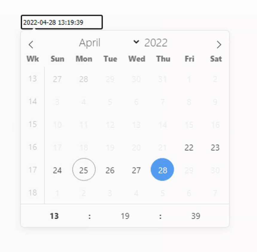
Programming environments of all kinds have long had mechanisms for callback functions – functions that are called whenever an event of some kind occurs. In JavaScript, this happens all the time, often in creative and sometimes in confusing ways. And those JavaScript Objects we were just talking about? Those parameters can be numbers or strings or arrays but they can also be JavaScript functions. Something that will be a little more difficult to manage using Delphi IDE properties. To show this in action, let’s assume that we want to limit the availalbe dates to +/- 3 days from the current date. And let’s also do something simple like output the selected date to console.log() whenever the date is changed.
  asm
    var date = new Date;
    var flatpickr1 = flatpickr('#DatePicker1', {
      allowInput: true,
      defaultDate: date,
      enableTime: true,
      enableSeconds: true,
      time_24hr: true,
      weekNumbers: true,
      onChange: function(selectedDates, dateStr, instance) {
        console.log(selectedDates)
      },
      enable: [ function(date) { // return true to enable
                  var d = new Date;
                  return (date.getDate() >= (d.getDate() - 3)) && (date.getDate() <= (d.getDate() + 3))
                }]
    });
  end;
The result is that only the dates that return true in the function call attached to enable are available for selection in the FlatPickr component. Anytime the selection is changed, the value is output as expected. But unlike the DatePicker1.Text value, this is an actual JavaScript datetime object.
Enabled Dates by Function
All of this is being done in JavaScript. So let’s see if we can move some of it over to the Delphi side. To start with, we’re going to change the onChange parameter to call a Delphi function instead of just console.log(). In this case, the available parameters from onChange are selectedDates, DateStr and instance. So let’s setup a call to a Delphi procedure like this.
  asm
    var date = new Date;
    var flatpickr1 = flatpickr('#DatePicker1', {
      allowInput: true,
      defaultDate: date,
      enableTime: true,
      enableSeconds: true,
      time_24hr: true,
      weekNumbers: true,
      onChange: function(selectedDates, dateStr, instance) {
        var d = new Date;
        pas.Unit1.Form1.FlatPickrChanged(selectedDates, dateStr, instance, d.getTimezoneOffset())
      },
      enable: [ function(date) { // return true to enable
                  var d = new Date;
                  return (date.getDate() >= (d.getDate() - 3)) && (date.getDate() <= (d.getDate() + 3))
                }]
    });
  end;
We’re also going to have to address the differences in how dates and times are handled between Delphi and JavaScript. In Delphi, a TDateTime value is a floating point number with the whole number representing the number of days since 1899-12-31 and the fractional number representing the time, where 0.5 = noon, 0.75 = 18:00 and so on. Not really any provisions for timezones or any indication whether a given TDateTime represents a local time or a UTC time. In JavaScript, dates are most often encoded as the number of milliseconds since 1970-01-01 00:00:00 UTC. This is similar to Unix, where it is often defined as the number of seconds since that time. To do this conversion then, we’ll need to know what the UTC offset is for any JavaScript dates, and then do a bit of math to get them into a TDateTime format. To make this a bit easier, we get the UTC offset (tzo) from JavaScript as it is a little easier to get hold of. JavaScript is also where the dates are created, so we don’t have to worry about whether Delphi and JavaScript agree on the timezone offset. We can also use the Delphi UnixToDateTime function to help a bit with the math. Here’s what the Delphi function looks like.
procedure TForm1.FlatPickrChanged(selectedDates: array of Integer;  dateStr: String; instance: JSValue; tzo:Integer);
var
  i: Integer;
begin
  console.log('selectedDates: '+IntToStr(Length(selectedDates)));
  i := 0;
  while i < Length(selectedDates) do
  begin
    console.log(intToStr(i)+': '+FormatDateTime('yyyy-mm-dd hh:nn:ss', IncMinute(UnixToDateTime(Trunc(selectedDates[i]/1000)),-tzo)));
    i := i + 1;
  end;
  console.log('dateStr: '+DateStr);
end;
The result is a set of console.log() entries that include the array of dates passed to the function as well as the last date selected, supplied as a text value. We’re just dealing with individual datetimes at the moment, but we’re already setup here for that to be expanded to date range selections and so on. Note the little -tzo offset subtracted from the calculated value. Be sure to check your work!
An Instance Here, An Instance There, An Instance Everywhere
This all works pretty well when you have one instance of a FlatPickr component and you don’t have any need to reference it directly. But what if you want to make changes after the FlatPickr control has been created? For example, maybe you’d like to change the dates that are enabled, based on some other changing criteria. To do this, you’ll need to access the existing FlatPickr instance. This is one of the variables passed in the onChange() function, but you might not want to wait until someone changes the date. And if you have more than one FlatPickr control on your page, it will be important to interact with them independently.
One way to do this is to define a form variable that will be used as a FlatPickr instance variable. We can assign its value when creating the FlatPickr instance. In this case, Delphi doesn’t have a clue what kind of JavaScript object this is going to be, so a type of JSValue is used. Kind of the JavaScript equivalent of a Delphi variant. As this is a form variable, it can then be referenced in JavaScript in the following way.
var
  Form1: TForm1;
  flatpickr1: JSValue;
...
procedure TForm1.WebFormCreate(Sender: TObject);
begin
  asm
    this.flatpickr1 = flatpickr('#DatePicker1', {})
  end;
end;
The flatpickr1 variable can then be subsequently used to refer to that instance when we want to make changes. Note we don’t need var before the assignment in this case as it is already allocated by Delphi. Here’s an example where we use a pair of Delphi TDate values to set the date range for the FlatPickr control. FlatPickr works with all kinds of date formats, but passsing it dates formatted as yyyy-mm-dd strings might be the least troublesome.
procedure TForm1.WebButton1Click(Sender: TObject);
var
  DateStart: TDate;
  DateEnd: TDate;
  DateStartStr: String;
  DateEndStr: String;
begin
  DateStart := Today;
  DateEnd := Today + 7;
  DateStartStr := FormatDateTime('yyyy-mm-dd',DateStart);
  DateEndStr := FormatDateTime('yyyy-mm-dd',DateEnd);
  asm
    this.flatpickr1.set('enable', [{ from: DateStartStr, to: DateEndStr}] );
  end;
end;
In this case, we’re using the set() function of FlatPickr to change the enable option by passing it a single date range. It is possible to pass more than one date range or a list of dates in the same manner, so check the documentation for whatever your particular requirements are. Most of the options that are available in FlatPickr can be adjusted after the control has been created using this same approach, not just the available dates. It is also possible to locate the FlatPickr instance by other means, if a form variable isn’t available. Some options include using various selectors, including jQuery, to locate the instance.
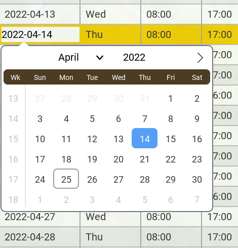
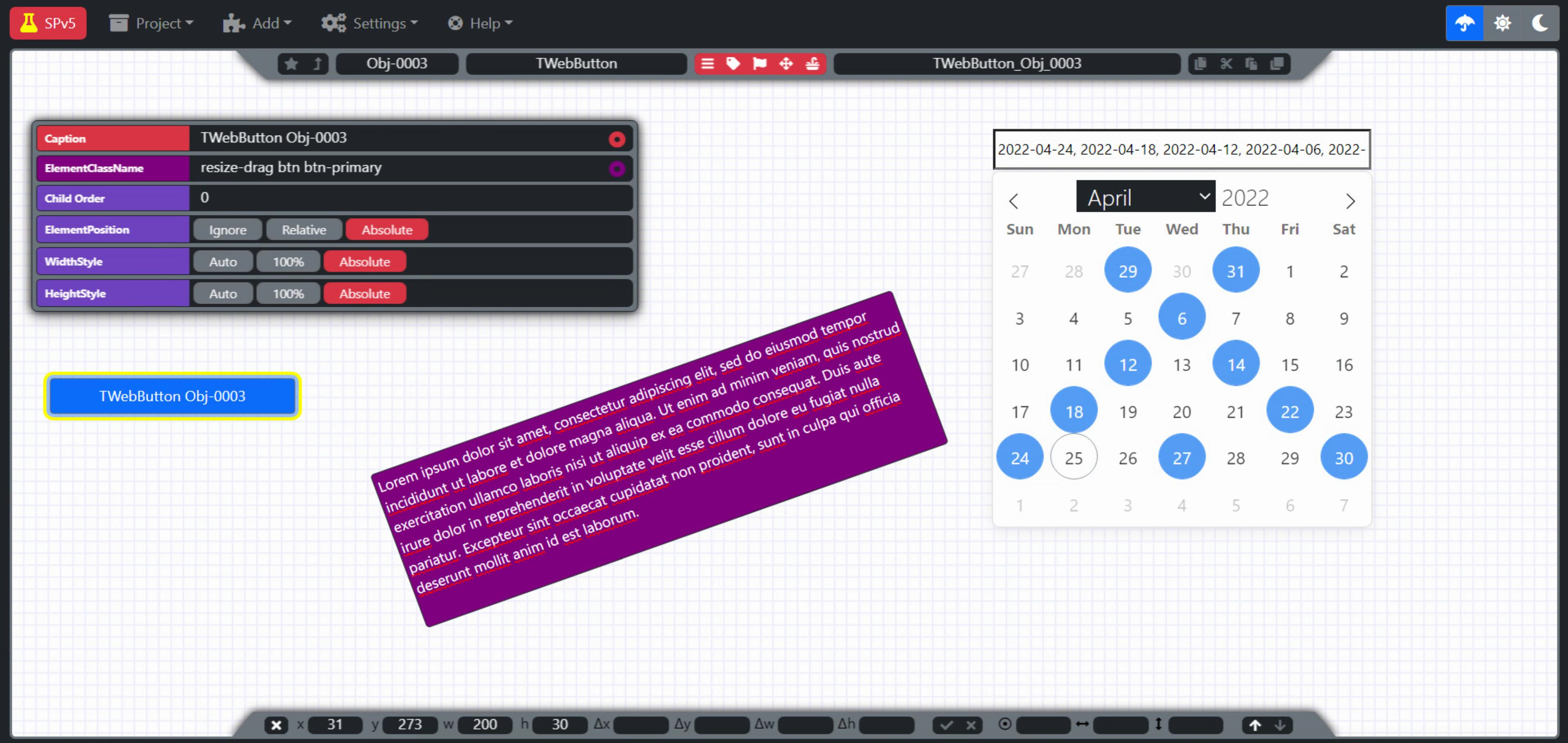
A Different Persepctive
Rather than a dropdown, lets instead have the calendar always visible. And instead of a single datetime, let’s work with selecting a date range. All we need to do is specify a different set of options. Here we can also specifiy a
  asm
    var flatpickr1 = flatpickr('#DatePicker1', {
      inline: true,
      appendTo: divHolder,
      weekNumbers: true,
      mode: "range",
      onChange: function(selectedDates, dateStr, instance) {
        var d = new Date;
        pas.Unit1.Form1.FlatPickrChanged(selectedDates, dateStr, instance, d.getTimezoneOffset())
      }
    });
  end;
The mode value in this case allows for the selection of a range of dates. When the onChange function is called in this mode, selectedDates is an array with two dates – the start and end date. If the mode was instead set to “multiple”, the selectedDates array would contain an entry for each of the dates that were individually selected.
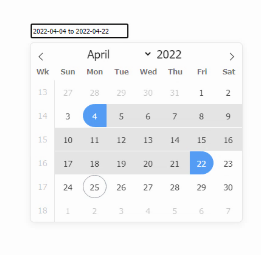
Inline view with range selection
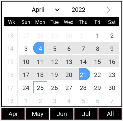
There are a host of other options to explore here, including displaying more than one month at a time, in both the inline and dropdown variations.
Pick a Color, Any Color
The last remaining item on our original list of must-haves is the ability to adjust the theme. The default theme is pretty workable, albeit a little on the large side. A number of themes are available from FlatPickr that adjust the colors slightly, but nothing too dramatic. Here is their dark theme, for example.
FlatPickr’s Dark Theme
You can access the themes by just adding another line to your Project.html to load the CSS file for the theme you’re interested in.
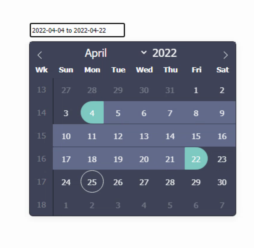
As FlatPickr is a 100% HTML/CSS component, you’re also able to change literally everything to match your own theme. I was primarily interested in making it much smaller, so it would be usable as a dropdown while editing tables, for example. I was also interested in having a different set of colors that would change as the overall theme changed, such as from a light mode to a dark mode. Both are achievable with a bit of patience tracking down the relevant CSS selectors. And of course we need some rounded corners in some instances. It may take a more than a little bit of fiddling, but it can almost certainly be adjusted to suit your particular tastes. The themes from FlatPickr can even be downloaded and adjusted to suit, but that might not be any less work, depending on the kinds of changes you’re interested in.
A couple of theme variations
Sample Project Upgraded
The Sample Project has been moving along at a pretty good clip. The version corresponding to this article, Sample Project v5, is a rather dramatic upgrade as compared to the last version. A small sample of various FlatPickr configurations can be added to the WorkArea directly, so you can try it out right away. As we move through the various other JS library controls, I’l try and get them added as well, moving the Sample Project into a proper sandbox for experimenting with all the things we’re covering.
Here’s a brief summary of other changes.
- Bootstrap nav bar multi-level menu system setup. Mostly disabled items, but you can see how it works easily enough.
- Ability to add multiple objects to the WorkArea, along with being able to set the properties for each separately.
- All those Bootstrap buttons are now tucked away into a Bootstrap Offcanvas element, setup to appear when needed.
- The Interact.js information is now displayed more propertly in a section at the bottom. With some more controls as well.
- Loads more changes and improvements, and perhaps a few surprises for the curious folk out there.
- A live version of the project is available at https://www.500foods.com/spv5 that you can try right now.
More FlatPickr?
That’s all we’re going to cover today. Next time, we’ll have a look at making a FlatPickr component that can be added to TMS WEB Core, so we can just add it from the Delphi IDE Component Palette. We’ll add some additional properties we’ve not yet covered to help keep it interesting. Until then, I’d love to hear what you think about datetime pickers in general, your thoughts about ISO8601 (basic vs. extended?!) or anything at all about the progression of the Sample Project.
Andrew Simard.
