Easily Build Powerful Personalized Dashboards With Javascript

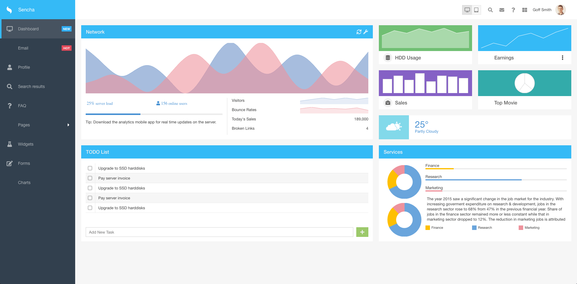
Today we are going to create our Dashboard with a personalized design using the power of Sass based on this example and using best practices.
How to Create an Ext JS Application Using Sencha CMD based on Templates
Let’s start installing and configuring Sencha CMD and then create our application from the admin template.
Starting with Sencha CMD
If you still don’t have Sencha CMD, you can download it for free here.
Once you have it installed make sure it was installed and configured properly, running this command on terminal/shell:
If it returns sencha cmd version, you are good to go. Here are more details on how to install, configure and use Sencha CMD, but this article will show all the important details.
Creating the application
The first thing you have to do is download the template by clicking here. The next thing to do is create your project structure and Sencha CMD can do it for you easily, just by running this command:
sencha -sd /Users/fabio/sencha-sdks/ext-7.3.1 generate app -s extjs-admin-dashboard-template-master DashboardExtJS ./dashboard-extjs
/Users/fabio/sencha-sdks/ext-7.3.1/is where your Ext JS SDK folder is.extjs-admin-dashboard-template-masteris the template downloaded.- DashboardExtJS is the name of our application that will be our namespace for our classes.
./dashboard-extjsis the path where it will create our project structure with the needed files.
Make sure when you run this command there is no error on the output. If everything was running correctly, it created your project structure. Let’s run our application with the initial structure. First navigate to your project folder:
Then, run the command that will up the server on a specific port:
The output of this command will show you the URL where your app will be available. For our case, it is available on http://localhost:1841/. Open it on your browser and you will see the initial app created:
Why use a template?
The benefits of using templates is a lot, mainly this admin dashboard template where you have the base classes and screen that you will need for your application.
Project Structure
Let’s understand a bit about the project structure generated, here are the important folder on our project:
- app is the directory where we will have our classes used on both devices (desktop and mobile). Here we can have base classes and no visual classes like Models, Stores, and some views that we will be able to reuse.
- classic is our directory where we have our classes used for the app running on the desktop.
- modern is where we save our classes that will be working to run the app through the phone.
- sass is where some of our important rules were defined to change the design of the app.
The Dashboard
In this post, we will focus only on our Dashboard and dive into some components and how it is working to make some actions. Important components to put on a dashboard are charts and lists, so let’s focus on these two kind of components.
How can I Create a Line Chart with Javascript Ext JS?
Our first component is the chart Network:
Our Dashboard is located on classic/src/view/dashboard/Dashboard.js, there we will identify the creation of the instance of the component network by xtype:
This works because our class has an alias called network. This class is located on app/view/chart/Network.js. Let’s learn more about it.
Ext.define('DashboardExtJS.view.chart.Network', {
    extend: 'Ext.chart.CartesianChart',
    ...
    axes: [
        {
            type: 'category',
            fields: [
                'xvalue'
            ],
            hidden: true,
            position: 'bottom'
        },
        {
            type: 'numeric',
            fields: [
                'y1value',
                'y2value'
            ],
            grid: {
                odd: {
                    fill: '#e8e8e8'
                }
            },
            hidden: true,
            position: 'left'
        }
    ],
    series: [
        {
            type: 'line',
            colors: [
                'rgba(103, 144, 199, 0.6)'
            ],
            useDarkerStrokeColor: false,
            xField: 'xvalue',
            yField: [
                'y1value'
            ],
            fill: true,
            smooth: true
        },
        {
            type: 'line',
            colors: [
                'rgba(238, 146, 156, 0.6)'
            ],
            useDarkerStrokeColor: false,
            xField: 'xvalue',
            yField: [
                'y2value'
            ],
            fill: true,
            smooth: true
        }
    ],
    interactions: [
        {
            type: 'panzoom'
        }
    ]
});
This class extends Ext.chart.CartesianChart what have 2 important configurations:
- store: The data source for the chart.
- axes have 2 types for this example:
- category: A type of axis that displays items in categories. This axis is generally used to display categorical information like names of items, month names, quarters, etc. but no quantitative values. You will define your field for the axis X of the chart.
- numeric: An axis to handle numeric values. This axis is used for quantitative data as opposed to the category axis. You will define your field for the axis Y of the chart.
- series is where you will define of type of your chart informing the field X and Y again. In this case, we have two lines defined on our chart, the red and the blue.
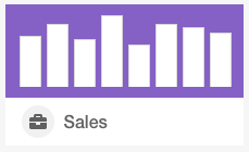
How can I Create a Column Chart with Javascript Ext JS?
Ext.define('DashboardExtJS.view.dashboard.Sales', {
    ...
    items: [
        {
            xtype: 'cartesian',
            ...
            bind: '{quarterlyGrowth}',
            axes: [
                {
                    type: 'category',
                    fields: [
                        'xvalue'
                    ],
                    hidden: true,
                    position: 'bottom'
                },
                {
                    type: 'numeric',
                    fields: [
                        'yvalue'
                    ],
                    grid: {
                        odd: {
                            fill: '#e8e8e8'
                        }
                    },
                    hidden: true,
                    position: 'left'
                }
            ],
            series: [
                {
                    type: 'bar',
                    xField: 'xvalue',
                    yField: [
                        'yvalue'
                    ]
                }
            ],
            interactions: [
                {
                    type: 'panzoom'
                }
            ]
        }
    ]
});
This is a very similar important configs where the type of the chart if defined on series config:
- store: The data source for the chart.
- axes have 2 types for this example:
- category: A type of axis that displays items in categories. This axis is generally used to display categorical information like names of items, month names, quarters, etc. but no quantitative values. You will define your field for the axis X of the chart.
- numeric: An axis to handle numeric values. This axis is used for quantitative data as opposed to the category axis. You will define your field for the axis Y of the chart.
- series is where you will define of type of your chart informing the field X and Y again.
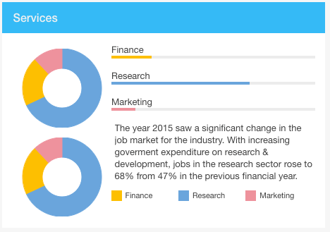
How can I Create a Pie Chart with Javascript Ext JS?
Ext.define('DashboardExtJS.view.dashboard.Services', {
    ...
    items: [
        {
            xtype: 'container',
            ...
            defaults: {
                ...
                bind: '{servicePerformance}',
                series: [
                    {
                        type: 'pie',
                        label: {
                            field: 'xField',
                            display: 'rotate',
                            contrast: true,
                            font: '12px Arial'
                        },
                        useDarkerStrokeColor: false,
                        xField: 'yvalue',
                        donut: 50,
                        padding:0
                    }
                ],
                interactions: [
                    {
                        type: 'rotate'
                    }
                ]
            },
            items: [
                {
                    xtype: 'polar'
                },
                {
                    xtype: 'polar'
                }
            ]
        },
        ..
    ]
});
The pie chart is very simple, you have to define the store for source data and the xField to simply to tell what field from your store will have the value to show on each piece of the pie.
How can I Create a Grid with Javascript Ext JS?
Ext.define('DashboardExtJS.view.dashboard.Todos', {
    ...
    items: [
        {
            xtype: 'gridpanel',
            ...
            bind: {
                store: '{todos}'
            },
            columns: [
                {
                    xtype: 'gridcolumn',
                    dataIndex: 'task',
                    text: 'Task',
                    flex: 1
                }
            ],
            ...
        }
    ]
});
Basically, all the important configs are:
- store: The data source for the grid.
- columns: An array of objects which define all columns that appear in this grid. Each column definition provides the header text for the column and dataIndex for the definition of where the data for that column comes from.
What’s next?
Learn more about other views of the application generated, there is a lot to see and reuse on your app.
Check out the full source code for the powerful Javascript dashboard over on GitHub!


