
An Introduction To D3 Heat Map
The heat map is a graphical representation of a numerical dataset which is a fantastic method for analyzing the frequency of a data set. It brings different color indications from warm to cool in specific x and y-axis areas. That means more significant interactions are represented using warmer colors in the area, while colder colors represent lower user interactions. The following graph shows a sample D3 heat map.
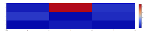
A heat map represents the relationship between two variables. By analyzing cell colors, you can determine the patterns between both variables. Variables can be any data type since we consider values as categorical numeric values or labels. The heat map shows the row(x-axis)/ column(y-axis)/ value when moving the mouse cursor on sections.
What are the different types of heat maps and different things you can do with them?
We can see different types of heat maps used in the different industries, such as website heat maps, geographical heat maps, stock market analysis heat maps, heat maps used in financial services and sports, and more. The key benefit of any type of heat map is it converts complex numerical datasets into a simplified, understandable visual graph and helps decision making.
What are website heat maps?
Website heat maps help product managers, product owners, and website owners determine how users interact with their website, make critical decisions, and find answers to critical questions. Suppose you have a website having considerable user traffic daily. You can perform activities such as,
- Identify user behaviors, interactions and evaluate user interests on the website
- Identify ignored things by users on the website
- Identify issues across different devices
- Determine if users are reaching an important content or not
Hence the business can improve the website by tracking user behaviors and discovering actionable scenes and activities. Website heat maps are used in online stores sites, media services such as Netflix, travel and hotel sites, eCommerce sites, etc. heat maps support measuring a website’s performance, understanding guests’ thinking, and determining friction scopes by recognizing dead clicks and redundant links.
For example, Netflix uses heat maps to determine the user’s streaming interests, most commonly watched movies and tv shows, identify most visited categories such as action, horror, Hindi, cartoon, etc. and personalize the user experience according to the user on their site. Following is a sample heat map generated for Netflix.
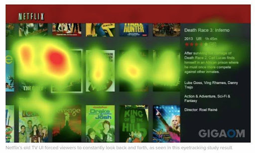
Image source: GigaOm
How are heat maps used in the stock market and financial services?
Heat maps are used in stock markets to make future decisions, such as identifying trending stocks in a certain period, identifying what shares to buy and what is the best selling price for a specific stock, and identifying the best time to invest by determining whether the overall market has a bullish or bearish trend.
From a financial perspective, we can use heat maps to visualize action items in companies such as,
- Interest rate fluctuation and fixed deposit placement ratio in banks
- How do companies’ investments in different assets such as blockchain, fixed deposits, treasury bonds, debentures, and share market bring ROI to the company?
- Identify and compare the annual budget allocations with past years.
These are only a few use cases of heat maps used in the financial industry. Usually, most organizations use heat maps for future predictions, to understand how their business behaves in certain environments, and make top management decisions.
What does D3 stand for?
D3 (Data-Driven Components) is a feature-rich Sencha Ext JS package. It enables you to build highly interactive data visualizations in the browser utilizing modern web standards. Such standards include HTML, SVG, and CSS. D3 is also open-source and free. So you can use it without spending any money.
D3 isn’t a one-size-fits-all framework that attempts to do everything. D3 instead concentrates on the source of the problem: data-driven document modification. This gets rid of proprietary representations and gives you a lot of flexibility, enabling web standards such as HTML, SVG, and CSS to show through. D3 is a fast, low-overhead database that can manage large datasets and also dynamic actions for engagement and animation. D3’s functional architecture permits code reuse through a diverse array of conventional and community-developed components.
What are D3 Heat Maps?
The ‘d3-heatmap’ component is used to show matrices with color-coded individual values. This component employs two Ext.d3.axes which are Data axes and a single Ext.d3.axis. Using a color axis, the numbers are represented. Heatmaps are a great way to show three-dimensional data in a two-dimensional graph. The HeatMap element casts X and Y data to axes, as you might expect. After that, a “color axis” is created from the Z values.
How can you create heat maps using your JS Framework?
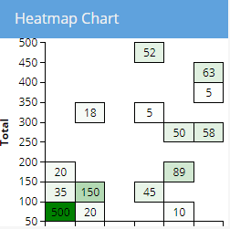
Creating heat maps is not difficult. You can provide x and y-axis data and a data set to generate a heat map using the D3 heat map in the ExtJS framework. The following code and heat map shows the relationship between different products and purchases in a coffee shop during a week.
Code snippet
Ext.create('Ext.panel.Panel', {
    renderTo: Ext.getBody(),
    title: 'Heatmap Chart',
    height: 250,
    width: 250,
    layout: 'fit',
    items: [
        {
            xtype: 'd3-heatmap',
            padding: {
                top: 5,
                right: 5,
                bottom: 5,
                left: 50
            },

            xAxis: {
                axis: {
                    ticks: 'd3.time.days',
                    tickFormat: "d3.time.format('%b %d')",
                    orient: 'bottom'
                },
                scale: {
                    type: 'time'
                },
                title: {
                    text: 'Date'
                },
                field: 'date',
                step: 24 * 60 * 60 * 1000
            },

            yAxis: {
                axis: {
                    orient: 'left'
                },
                scale: {
                    type: 'linear'
                },
                title: {
                    text: 'Total'
                },
                field: 'bucket',
                step: 50
            },

            colorAxis: {
                scale: {
                    type: 'linear',
                    range: ['white', 'green']
                },
                field: 'count',
                minimum: 0
            },

            tiles: {
                attr: {
                    'stroke': 'black',
                    'stroke-width': 1
                }
            },

            store: {
                fields: [
                    {name: 'date', type: 'date', dateFormat: 'Y-m-d'},
                    'bucket',
                    'count'
                ],
                data: [
                    { "date": "2022-04-01", "bucket": 100, "count": 35 },
                    { "date": "2022-04-01", "bucket": 50,  "count": 500 },
                    { "date": "2022-04-01", "bucket": 150, "count": 20 },
                    { "date": "2022-04-02", "bucket": 300, "count": 18 },
                    { "date": "2022-04-02", "bucket": 50,  "count": 20 },
                    { "date": "2022-04-02", "bucket": 100, "count": 150 },
                    { "date": "2022-04-04", "bucket": 300, "count": 5 },
                    { "date": "2022-04-04", "bucket": 450, "count": 52 },
                    { "date": "2022-04-04", "bucket": 100, "count": 45 },
                    { "date": "2022-04-05", "bucket": 150, "count": 89 },
                    { "date": "2022-04-05", "bucket": 250, "count": 50 },
                    { "date": "2022-04-05", "bucket": 50,  "count": 10 },
                    { "date": "2022-04-06", "bucket": 350, "count": 5 },
                    { "date": "2022-04-06", "bucket": 400, "count": 63 },
                    { "date": "2022-04-06", "bucket": 250, "count": 58 }
                ]
            }
        }
    ]
});
D3 heat map generated using Ext JS
Why should you use Sencha Ext JS?
So I believe you have learned and got a thorough idea of what heat maps are, the use cases, and how you can implement a heat map. You can develop your heat map using any JS framework or code editor such as VS Code and notepad++.
But why you need to use Sencha ExtJS as your JS framework is because it provides you with an enhanced and advanced heat map library, which is Ext.d3.heat map. Using Sencha makes your JS coding easier and more efficient since it is easy to set up, supports MVC design patterns, auto-generates code, and brings you the ability to create beautiful UI components. Since the Sencha framework has a larger community, numerous blog posts, and documentation, it helps you design and implements your own customized and advanced heat maps.
Get started with Sencha Ext JS today!


