FusionTime

Create high-performance time-series visualizations and stock charts in JavaScript (HTML5)

FusionTime helps you visualize time-series and stock data in JavaScript, with just a few lines of code. Whether it’s a simple time-series chart, stock chart, millions of data points in a chart, or even complex multivariate analysis, you can render all of them with the same ease-of-use.

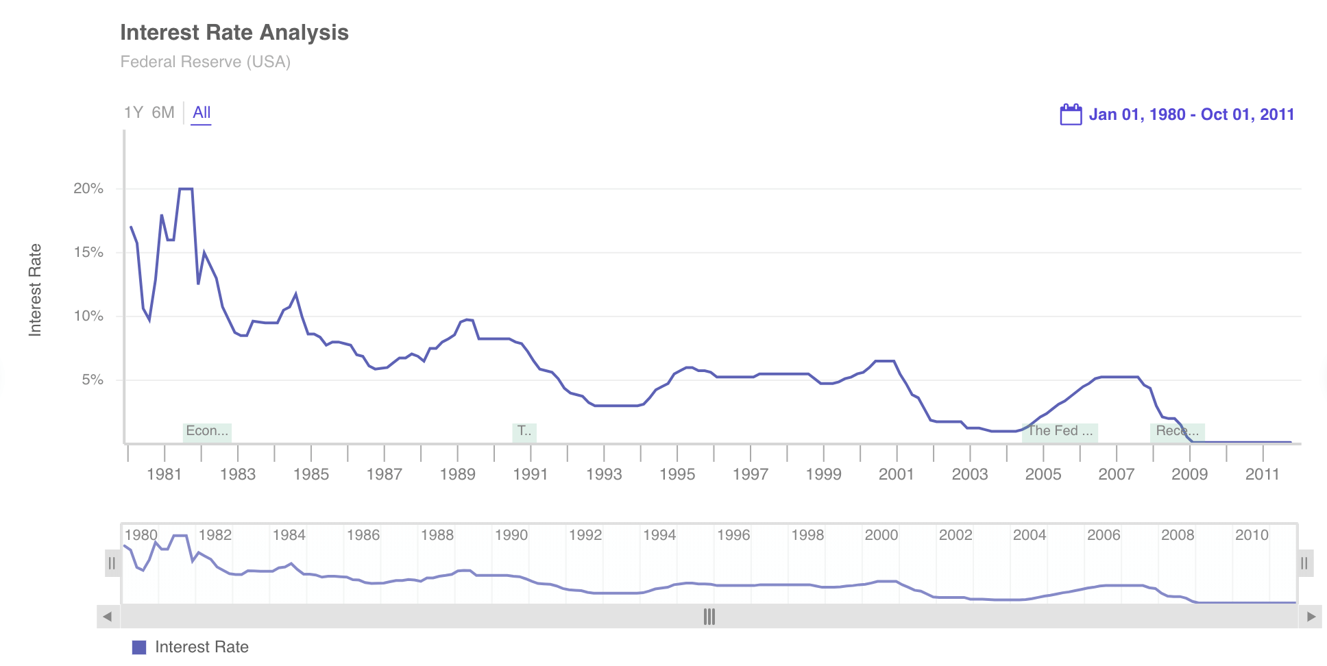
You get out-of-the-box interactivity like time navigator, date range selectors, tooltips with crosslines, interactive legend and much more. In addition, you can plot your data as column, line, area, candlestick, OHLC and even variants like stacked column & area, and overlay them with event and data markers.

And the best part is – the same chart runs across desktop, tablet and mobile, through responsive layouts, on all modern browsers – without any additional effort on your side.

Solicitare ofertă

Description

FusionTime to Visualize millions of data points

FusionTime can handle millions of data points in browser, and automatically choose the right aggregation to fit the data in the size of the chart.

Plot a variety of chart types

Whether it’s column, line, step line, area, candlestick, OHLC or stacked variants, FusionTime allows you to easily plot all of them.

Enable multivariate analysis

FusionTime enables you to plot and explore different variables in vertically stacked canvases, connected through common time-axis and tooltips.

Plot date or time data at any atomicity

Whether your data is recorded at intervals of millisecond or years, FusionTime can plot all of them, with auto-aggregation and time-axis scaling.

Run data operations in browser for re-visualization

Perform operations on existing data in-browser like filtering, grouping or binning, without having to fetch data from the server each time.

View seamlessly across browsers and devices

Every chart created using FusionTime works seamlessly across desktops, tablets or mobile phones (touch-optimized), without any additional effort.

Customize look & feel to your needs with FusionTime

Use our pre-existing themes, or extend them through simple JSON and CSS configuration to make your chart look & feel like your brand.

Powerful features for better exploration of time-series data

Powerful time navigator

The time navigator, which is automatically rendered at the bottom of each chart, enables view of the entire data at a glance. The date range can be easily adjusted through the handlebars and further scrolled through.

Date range selectors

Date range selectors

While the time navigator allows visual selection time range, the Standard range selector allows quick selection of business date ranges (e.g., week, month, quarter etc.). The custom range selector allows precise selection of start and end date/time.

Overlay of important events

Overlay of important events

Use event markers to indicate holidays (e.g., Christmas) or business specific events (e.g., start of a marketing campaign) on the time-axis for better interpretation of data. Show additional information for each event in tooltips.

Annotation of data

Annotation of data

Use data markers to highlight specific events pertaining to data (e.g., split or dividends in case of stocks, server events in case of network monitoring) next to the data point. Show additional information for each event in tooltips.

Auto scaling of time-axis

Auto scaling of time-axis

Based on the size of chart, the time axis intelligently scales to show data aggregated by appropriate bin size, relevant major and minor ticks, which correspond to human-friendly dates.

Multi-canvas tooltip

Multi-canvas tooltip

When plotting multiple variables across vertically stacked canvases (multivariate analysis), multi-canvas tool-tips enables you to see data for each variable for any given time instant, along with vertical crosslines.

Plot Reference lines

Plot Reference lines

Plot reference values (e.g., targets, thresholds etc.) as reference lines on any canvas in the chart, with a descriptive label and custom colors.[/accordion]


Support for linear and log axis

Support for linear and log axis

If the data is skewed towards large values or the need is to show percent change or multiplicative factors, switch from linear axis to logarithmic axis with one simple configuration.


Plotting of missing data

Plotting of missing data

If the data has missing values for certain dates, the chart can plot the series with broken lines indicating that data is missing.