VCL Grid goodies #3

Today, we have a look at another often overlooked but yet convenient feature of TAdvStringGrid (and also TDBAdvGrid) from the TMS VCL UI Pack: HoverButtons!
Activating HoverButtons
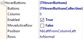
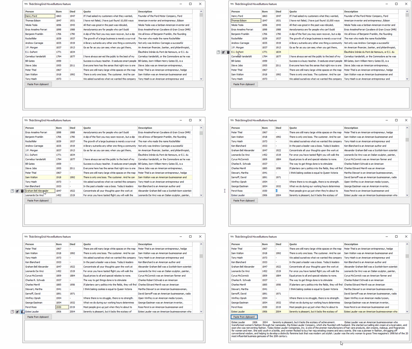
With the HoverButtons, you can quickly setup actions to be performed on rows in the grid where the mouse is hovering. It is enabled by just setting grid.HoverButtons.Enabled = true. This means, that when the mouse hovers over a row, a small panel hosting buttons will appear at a column of choice in the grid. This column is set with grid.HoverButtons.Column. WIth the property grid.HoverButtons.Position, you can specify in what relative position with respect to this column the panel should appear.

Configuring the buttons
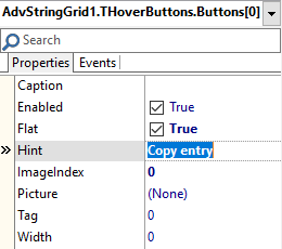
To add any number of buttons on the panel, the collection grid.HoverButtons.Buttons can be used. This is a collection of the type THoverButtonsCollectionItem and allows to set the caption of such button, an imagelist ImageIndex, a picture, the hint, enabled state of the button …

Just add any number of buttons needed for different actions to be performed on the row.
Reacting to HoverButtons clicks
When a button on the HoverButtons panel is clicked, this triggers the event OnHoverButtonClick returning the index of the button clicked. Performing the different actions for the different button clicks as such is simple:
procedure TForm1.AdvStringGrid1HoverButtonClick(Sender: TObject; ARow: Integer;
  AButton: THoverButtonsCollectionItem);
begin
  case AButton.Index of
  0: begin
       // select the entire row and copy it to the clipboard
       AdvStringGrid1.SelectRows(ARow,1);
       AdvStringGrid1.CopySelectionToClipboard;
     end;
  1: begin
       // invoke the inplace editor for the 2nd column cell
       AdvStringGrid1.Col := 2;
       AdvStringGrid1.ShowInplaceEdit;
     end;
  2: AdvStringGrid1.RemoveRows(ARow,1);
  end;
end;
Hovering & hints
Now we are discussing hovering, we can as well highlight another small but neat feature of the grid and that is to show the content of cells via a hint when the mouse hovers the cell. This is activated by setting grid.ShowHint = true as well as grid.HintShowLargeText = true. Whenever the text does not fit in the size of the cell, the grid will automatically display it as hint text for the cell. As a standard Delphi hint is just a single line of text hint, we add the TMS THTMLHint component on the form. This will replace the standard Delphi VCL hint and this hint can display multiple lines of text. The THTMLHint component also offers a MaxWidth property with which we can set the maximum width of hints to be displayed. And of course, if the text exceeds this MaxWidth, it will be rendered wordwrapped (and even formatted) in the HTMLHint. No code needs to be written for this. Drop a THTMLHint on the form, set HTMLHint.MaxWidth property and set the grid properties grid.ShowHint = true and grid.HintShowLargeText = true. The effect can be seen in this recording.

Want more goodies?
Looking for more interesting features in the VCL TAdvStringGrid or in other components uncovered? Let us know what you want to see demonstrated in a next episode!

